The Art of Cover Design
Posted on Jul 23, 2015
Seagull Books is one among the few publishers that gives as much importance to the aesthetics and appearance of a book as its content. Throughout the history of Seagull Books, Calcutta, Naveen Kishore envisioned digital cover design for the books, and his idea was inherited, incorporated and improvised by Sunandini Banerjee, who has illustrated over 300 covers for the books published by Seagull.Inspired by the creative expertise of Sunandini, we requested for a class on Cover Design at the Seagull School of Publishing. We had chosen some of the books and wanted to know about the creative process she went through while designing them.
To begin with, my knowledge of handling technology, especially as far as the treatment of representing a translation of a text pictorially is concerned, was elementary. QuarkXpress and InDesign are fairly user-friendly, simplifying and allowing the execution of a picture the designer has in mind. To become a digital or graphic designer, one has to have sufficient knowledge of technology and its use, paired with an aesthetic sense. While designing the cover of a book, one needs to know what the book needs. Translating words into an illustration is crucial in cover design. Be it an individual book or a series consisting more than one, a book is identified by or remembered through its cover, colour, font, style, texture, etc.
From a publishing perspective, Sunandini says, identifiable covers of different books in a series have twofold use. It helps the reader to identify which books go together in a series, that is, it can have a visual representation on a bookshelf in the bookstore; and, from a commercial aspect, the series design becomes a subtle advertisement for the entire collection in a way.
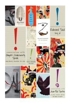
Generally, on a series, to put the picture of the person is something that has already been done. However, in the Conversation Series published by Seagull Books, the look of the covers needed something that could translate ‘conversations’, ‘gesticulations’, ‘excitement’ and a ‘free-flowing statement’; and a simple ‘!’ represented all and more. The exclamation mark is treated as a picture in the conversation series. Within the series, certain aspects of the typeface are negotiable and certain things must remain static, like the font of the exclamation mark can change, while there has to be a standard typeface. The colour of the font can change but the background, which is different hues of beige, can differ only between ten and twenty per cent. The run-on texts cannot change. It is a similar kind of an idea that has been followed in the Communism Series, where there are photographs, scanned pictures, collages, a greenish tint on the photographs and an old paper look; however, the basic colour scheme (highlighting red, of course) remains the same. The important thing about a series cover is that, the books have to look similar together as a series at the same time each book has to be convincing enough to stand alone as a separate one. Sunandini aptly explains, ‘It’s a look but not a formula.’
Blurb writing becomes very important for cover design because, most of the time, the designer works under time constraints. The blurb, in this case, should be capable of being translated into a cover. A designer simply does not have time to read an entire book before designing its cover because he/she is working on many covers at any given time.
While designing the cover of a book, one should be willing to experiment with colours and pictures, understand the philosophy of the book and experience the evolving nature of thoughts and words into illustrations. Such beautiful covers have indeed been done at Seagull. To mention a few, there is a set of cover designs which are minimal, some have collages, some have specific motifs and many other styles. The designer’s responsibility is not to give away too much of the story on the cover, but to suggest an entry point into the book. For instance, the novel Privy Portrait by Jean-Luc Benoziglio is a hilarious story of a man who refers to his encyclopedia for everything he encounters in his daily life. He secretly reads them in the bathroom, so as not to annoy his family members. The cover has the frame of a mirror reflecting a page of an encyclopedia and two taps representing the bathroom. Toby Litt’s Life-Like has mannequins and a vibrant background because mannequins are a close representation of humans and the bright colours show life and animation. Seedtime by Philippe Jaccottet has an elegant cover with a beautiful passage from the book, a water pot, dusty shades of green in the background, the grass running through the words and clocks giving an organic form to the title as well as the cover.
Sometimes a book would need extensive design to match the story, and sometimes a simple, soothing cover would help in retaining the essence of the book. The designer’s responsibility is to create the rapport between the story and the cover, and maintain balance. It is necessary to know where to stop and leave the rest for interpretation.
Rini Maria
Leave a comment ×